
Wednesday, September 5, 2007
Illustrating Life With Words
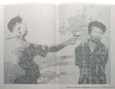
This is a promotional device created by DM9 DDb Publicidade, Sao Paulo in 1998. It is part of a series of ads for a Brazilian newspaper that used newsprint type to recreate famous images. This one shows a memorable photograph of an exocution in Vietnam. The medium for this ad is very creative and seems appropriate for the promotion of a newspaper. It reminded me of a website I once discovered that you could upload an image and it would turn it into text art similar to the style shown in this ad. From a distance, This technique is extremely effective as it is obvious that the image has been produced in a non-conventional way, but requires a closer look for the method to become apparent.
Pandora
 I came across this website called 'Pandora' some time ago and am a regular user. As the name suggests, it opens up a whole new world to the user. Pandora is an online radio station that is as customisable as it can get without infringing on copyright laws. It has an online library of thousands of songs in CD quality with each artist's style analysed and documented. The user can specify a radio station based on the style of an artist or song they like and Pandora will create a playlist based on your personal preference. The user can skip tracks and rate them 'thumbs up' or 'thumbs down'. Pandora remembers the users preference of music and plays more or less of that artist depending on their rating so each station you create gets better and better. It will also retrieve information about an artist if desired and show a profile and gig dates etc.
Pandora is a funtional site that has a simple user interface. It is a great website for those interested in discovering new music in a specific genre or those who fancy a change of music to their own collection.
Tuesday, September 4, 2007
Heinz
These Adverts for Heinz were created by BS Dorland, London in 1991. I chose to show them in this blog as they made me think about the different contributing factors that have bearing on how successful a piece of advertising is. Firstly, they have taken advantage of the fact that Heinz Ketchup pours out of the bottle at a snail's pace and turned it into a charming feature rather than an annoying trait as it could be perceived. This throws a humorous twist on a characteristic that could otherwise put a customer off buying Heinz from a bottle.
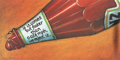
Secondly, the style of these ads is particularly striking. They are created in a painterly kind of way, mimicking a still-life painting and making a feature out of the Heinz branding. This suggests a brand that has values such as loyalty, tradition, logevity and perfection.
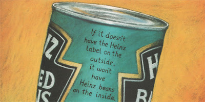
As well as suggesting the brand values of Heinz and having a witty approach to the copy, these adverts also suggest that Heinz is a brand with a conscience that cares about its customers' health. This is strengthened by the copy on the Heinz Salad Cream ad that reads "The only time we use artificial colouring is when we print the label". As a campaign, these three ads work extremely well as each one offers a different value associated with Heinz that will heighten their customers' brand loyalty.

Hot!!!
When I came across this advert for Parmalat Hot Ketchup it immediately grabbed my attention. It was created by Brazilian agency, DM9 DDB Publicidade, Sao Paulo in 1999. I think it is a brilliant example of communication design and admire the simplicity of the image, which works to great effect. The pouring ketchup takes the form of a mouth on fire, as if they have just eaten something really spicy. The blurring of the image intensivies the feeling of heat and the red colour scheme glows above the black background. This ad shows that simplicity is the key to successful communication - just one simple element delivers the message of this brand.


"READ THIS YOU PIECE OF SHIT"
 I have always been interested in impactful imagery and love the use of photography in print advertising, which is why I find Saatchi & Saatchi's cause-related advertising so successful. Often considered shocking or controvercial, Saatchi and Saatchi's designs never fail to grab your attention. For example, this print advert uses shock tactics to offend the reader, initially grabbing their attention and intiguing them enough to read on. After reading the first few paragraphs, you are informed that it is addressing human rights and the headline becomes more appropriate. It reads "If you're offended by this advert, you should be. Nobody should be treated like this. Yet unfortunately, there are millions of people around the world who are."
Their technique is often simple, using imagery with a plain background to increase the focus of the advert with a short, snappy headline that is usually a witty pun to accompany it. These two elements work in harmony with each other on the page to strengthen the idea - without the headline, the imagery would not make sense and vice versa.

A combination of offensive imagery and language is quite humorously contradicted by the polite statement "please clean it up" in this advert adressing dog fouling.

The two images above are particularly impactful. The anti-smoking advert uses an image of a cigarette that has been cleverly transformed into the image of a snail by manipulating the shape of the smoke and has the headline "slow poison". The association created between the headline and image of the snail is witty and memorable. The advert to the right shows the bruised face of baby. Its battered appearance makes it almost appear to be five years older, making it a hard image to forget. Saatchi & Saatchi use a metaphorical headline to highlight the atrocities that occur behind closed doors and bring our attention to towards making a change.

This image shows frames from a television commercial created by Saatchi & Saatchi for NSPCC in 1999. It shows iconic images found in a child's bedroom such as an England footballer and Rupert the bear covering their eyes to the reality of child abuse. It highlights the fact that you don't have to see what's going on to know that there is something sinister happening. I also find this advert a good example of how the shocking acts of child abuse do not need to be shown in order for them to be imagined by the viewer, making the advert accessible by a wider audience and more successful.
Saatchi & Saatchi are world-renowned for their cause-related ideas. There are far too many brilliant ads to write about them all, but these are a few more that I admire.


Monday, September 3, 2007
Smirnoff "Sea"
This is the new CGI masterpiece commercial for Smirnoff, created by JWT London. The first time I saw this advert I was amazed by the extraordinary visual experience and had to find out more about it. The special effects wizards behind the Harry Potter films were called upon to create this amazing TV ad in which war planes, coins, old statues and battleships are ejected by the sea. It expresses the effort that goes into Smirnoff's purification process by linkening it to the purification of the ocean, using the strapline "Extraordinary purification", promoting Smirnoff as the most pure vodka.
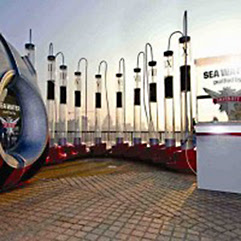 In addition to the online game, Smirnoff have created an ambient promotional device to strengthen their brand values and hit home the extraordinary lengths they go to to purify their vodka.
This is an amazing, state-of-the-art water purification installation that has just appeared at the Rip Curl Board Masters Festival this summer, where it purified Newquay's sea water for adventurous festival goers to sample. The installation takes water directly from the sea, purifying it to make it clean enough to drink there and then. This clever device complements the new television commercial perfectly and has already filtered some of the world's most dirty water on an international tour. Dirty water flows through a three-stage purification process cleaning it to a high level and mimicking the trademark 'triple distilled' slogan of Smirnoff. It is then given a rigorous ten times filtration through Polish charcoal to remove invisible microscopic impurities and give the water a smooth, clean, pure finish for the public to enjoy. This is the same process used in the production of Smirnoff vodka.
The advert is part of a £15m annual marketing budget. It was shot by Daniel Kleinman, the director responsible the opening credits for Casino Royale and a numerous other successful TV commericals. The special effects have been created by Framestore CFC, which created sequences for the Harry Potter films, X-Men: The Last Stand and for Guinness's spectacular evolution-backwards commercial "noitulove" I have previouosly posted on.
Smirnoff are aiming their latest publicity creations at young men. Digital agency AKQA have created an online game called "The Smirnoff Purifier", available at smirnoff.com to complement the TV advert. It allows players to fire objects at a target from a "raised platform off the south coast of England". In addition to the online game, Smirnoff have created an ambient promotional device to strengthen their brand values and hit home the extraordinary lengths they go to to purify their vodka.
This is an amazing, state-of-the-art water purification installation that has just appeared at the Rip Curl Board Masters Festival this summer, where it purified Newquay's sea water for adventurous festival goers to sample. The installation takes water directly from the sea, purifying it to make it clean enough to drink there and then. This clever device complements the new television commercial perfectly and has already filtered some of the world's most dirty water on an international tour. Dirty water flows through a three-stage purification process cleaning it to a high level and mimicking the trademark 'triple distilled' slogan of Smirnoff. It is then given a rigorous ten times filtration through Polish charcoal to remove invisible microscopic impurities and give the water a smooth, clean, pure finish for the public to enjoy. This is the same process used in the production of Smirnoff vodka.
Thursday, August 30, 2007
Lord of the Rings - On Stage!
“THIS SHOW IS A WONDER….
Go with an open heart, wide-open eyes and prepare for enchantment”
The Times
I had never been to the West End before and despite hearing marvellous things about their productions, my expectations weren't high when I went to see the Lord of the Rings at the Theatre Royal. I thought that a musical wouldnt be my 'thing'. This was partly true as I couldn't seem to get quite as involved in the singing and dancing as the man sat next to me, who was literally crying in ecstasy. However, it was a visual spectacle that was thoroughly enjoyable.The Times

The Theatre Royal is a lovely building with an impressive history and a huge auditorium inside. As you enter, an impressive setup awaits with orchestral music that sets the scene for Middle Earth. The Lord of the Rings takes you on a breathtaking journey of enchantment from start to finish. Among the highlights of the show were the dramatic lighting, precision choreography and stunning design. The special effects were second to none and completely unexpected as it is hard to believe they are possible on the stage, for instance, the apparent disappearance of Bilbo Baggins in Scene I. The costume design was particularly impressive and the way in which the stage transformed from one scene to the next, utilising various materials and cloth to great effect.

At a production cost of £25,000,000, it is the most expensive musical to date and sets a high standard for any production looking to better it.
Wednesday, August 29, 2007
Campana Brothers in the Garden
While visiting the V&A, some extraordinary structures caught my eye - not in a purposefully displayed exhibit, but in the John Madejski Garden. Brazilian designers Fernando and Humberto Campana transformed the garden with a unique installation exploring the use of bamboo, a material often featured in their work. The sticks of bamboo were hinged together in an extended teepee, snaking their way aound the garden which the viewer can interact with.
 It is only since being to the museum that I have discovered that the interesting seat I sat on was part of the installation by the brothers. They are a new, outdoor edition of their ‘Vitoria Regia’ seats, specially designed to mark the V&A’s 150th anniversary.
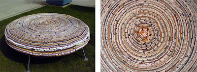
They were inspired by the giant water lilies found in the Amazon and named in Queen Victoria’s honour. Their intriguing pattern is created by small pieces of coloured foam arranged in concentric circles. The look and texture of the seat drew me in like a bee to honey and was surprisingly comfortable.
 It is only since being to the museum that I have discovered that the interesting seat I sat on was part of the installation by the brothers. They are a new, outdoor edition of their ‘Vitoria Regia’ seats, specially designed to mark the V&A’s 150th anniversary.
They were inspired by the giant water lilies found in the Amazon and named in Queen Victoria’s honour. Their intriguing pattern is created by small pieces of coloured foam arranged in concentric circles. The look and texture of the seat drew me in like a bee to honey and was surprisingly comfortable.
Victoria & Albert Museum
Although I have been to the V&A a few times before, this time was the first that I realised how magnificent the building itself is. Designed and expanded over the years by various architects, it is a fine example of Victorian architecture.
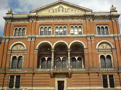
It is not only its expansive collection of over 4.5 million objects that makes the V&A the world's largest and finest museum of decorative arts and design, but also the fact that it was purpose built as a gallery, making the rooms and corridors perfectly spacious and lit for the displays.
 This image shows the building, viewed from the garden area. The attention to detail is worthy of an exhibit itself, especially if you look under the arches and towards the roof at the intricate tiling and craftsmanship.
Paper Movies

Paper Movies is an exhibition at the V&A in London that runs until 18th November. The display explores new directions in graphic and magazine design in the 1940s and 1950s. During this time, the design of American fashion magazines was changed forever by the arrival of two russian men, Alexey Brodovitch and Alexander Liberman. Brodovich found his position as art director at Harper's Bazaar and Liberman at Vogue after absorbing radical ideas of European avante-garde in Paris. They aimed to modernise magazine graphics and bring photography to the fore. The main characteristics of their influence were articles that resembled stills from a film rather than the wooden and lifeless poses of models.

The first display cabinet shows this magazine spread designed by Brodovitch. The image is composed from an enlargement of one of Jackson Pollock's action paintings to resemble dancing figures. I find the idea of extracting recognisable forms from an abstract image fascinating. The execution of this page is extremely successful as the abstract figures have a beautiful illustrative feel to them while the proportion of black to white keeps a sense of balance and perspective.
The next cabinet shows work by photographer, William Klein. Klein was one of Liberman's most notable discoveries. He saw one of Klein's exhibitions in Paris and asked him to come back to New York to further explore his growing talent for photography.

Returning to his native New York, Klein was deeply affected by the changes he saw. Liberman asked him to record his observations as a photographic diary. Klein had relatively little experience as a photographer, giving his images an endearing energy, uninhibited by traditional social and moral contraints. It was some of Klein's less experienced work that had the greatest appeal, showing that a touch of naivety can cut through the clutter of contemporary design. It is this quality that I found so fascinating throughout the 'Paper Movies' exhibition.

The next part of the exhibition concentrated on the work of Lillian Bassman for Harper's Bazaar. Harper's bazaar was the first fashion magazine to use action photography rather than lifeless model poses. The black and white images resemble stills from a film, justifying the title of the exhibition, Paper Movies. Her photogrpahy is extremely inspiring, utilising natural lighting conditions to great effect while holding the spontaneity seen in the photography of William Klein.

Bassman's photograhy is mysterious and romantic, making the whole image a symbol of expressionistic glamour. Her elegant and original work is achieved through darkroom manipulation, specifically by blurring and bleaching areas of the photographs. At Harper's Bazaar, Lillian Bassman brought an aire of sophistication and a new look to fashion photography as she did not rely on beautiful models and clothes as the sole essence of her photographs.

This photograph grabbed my attention more than any as the lighting is spectacular and creates the focus of the image. The motionless figures around the three central woman also contribute to adding focus and perspective to the photograph.
The final part of the exhibition that I noted to be particularly interesting was an open magazine spread of Harper's Bazaar from 1950. This page shows two illustrations, however, it is the method by which they were produced that I found intriguing. The painterly lines were produced by printing negatives through tiny holes cut in card, exposing only selected areas and then enhanced with bold strokes of colour.

I found 'Paper Movies' intriguing and inspirational. It is fascinating to be shown periods in time where a major change took place in design, especially when the work produced from this change is impactful and to your taste. It is an educational experience to learn how these images between the 40s and 60s were produced and manipulated, as it makes a refreshing change from the mechanical production of commercial advertising techniques of today. It raises the question whether a more traditional and hand crafted appeal would help cut through today's commercial clutter.
Sunday, August 12, 2007
Nike/Adidas Ads
This is one of the early print advertisements in the 'Just Do It' campaign by Nike in 1990. As with the Vintage Guinness advertisements I posted on, I find it intriguing to discover the originals that captivated their audience and from which the brand values and slogans of today originated.
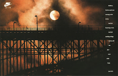
It is hard not to be gripped by this poignant image the first time you lay eyes on it. The silhouette image of the bridge against the slightly abstract night sky is extremely atmospheric and instills the same feelings of loneliness and escapism that the runner would experience. It captures the solitude and exhilaration of the long-distance runner perfectly. The copy reads,
"Mothers, there's a mad man running in the streets, and he's humming a tune, and he's snarling at dogs, and he still has four more miles to go. Just do it."
The copy has a sense of humour that any runner can relate to. I find it extremely inspiring as it had the power to make me reminisce and look fondly on the feelings of exhaustion while running and the will-power to carry on and 'go the extra mile'. Even after not going running for a long time, this advert motivates you to pull on your trainers and hit the road.
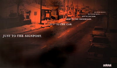
I find this Adidas poster from 1995 to have a similar message and affect on its audience as the Nike advert. The copy is a reflection on the runner's thought process and drives home the 'go the extra mile' mentality in the hope that you associate this achiement with Adidas trainers.

It is hard not to be gripped by this poignant image the first time you lay eyes on it. The silhouette image of the bridge against the slightly abstract night sky is extremely atmospheric and instills the same feelings of loneliness and escapism that the runner would experience. It captures the solitude and exhilaration of the long-distance runner perfectly. The copy reads,
"Mothers, there's a mad man running in the streets, and he's humming a tune, and he's snarling at dogs, and he still has four more miles to go. Just do it."
The copy has a sense of humour that any runner can relate to. I find it extremely inspiring as it had the power to make me reminisce and look fondly on the feelings of exhaustion while running and the will-power to carry on and 'go the extra mile'. Even after not going running for a long time, this advert motivates you to pull on your trainers and hit the road.
I find this Adidas poster from 1995 to have a similar message and affect on its audience as the Nike advert. The copy is a reflection on the runner's thought process and drives home the 'go the extra mile' mentality in the hope that you associate this achiement with Adidas trainers.

Friday, August 10, 2007
Second Life
 " Second Life is a 3-D virtual world entirely built and owned by its Residents". It is a website that has grown hugely in popularity over the last few months and has over 8,718,000 residents. Although participating in this virtual world is not my cup of tea, I find the idea fascinating and its inventors genious. It is not surprising that this amount of people have seized the opportunity to be a part in the creation of this new digital world.
To its members, Second Life gives the opportunity to live a life far removed from their real one and presents a method of interaction never seen before. Another appeal that attracts people to the site is that it is a world of equality and equal opportunities, providing a a society that is more inclusive. Residents can explore, socialize, build, participate in activities and even trade items and services with each other. Their appearance within the network can be completely customised and even tailored to resemble the person they represent.
Following in the footsteps of more primitive, but hugely popular social networks like myspace and facebook, Second Life poses the question, is this where communication is taking us? It becomes easier and easier to communicate with people as technology advances and in the comfort and safety of our own homes, but as a result of this, are we taking a step backwards when it comes to communication in the real world and will we eventualy lose the art of conversation?
I discovered the Second Life website after reading an article in NME about Secondfest - a virtual three-day music festival inside Second Life.

This article shows an interview with James Smith of band, Hadouken after playing a set for a virtual festival, which saw 30 bands playing to over 15,000 people. Second Fest even has its own myspace page, http://www.myspace.com/secondfest. The idea of having an online music festival seemed to me absurd, but to the 'residents' of Second Life, their virtual world is as real as the world we live in.

Tuesday, August 7, 2007
Aquafresh - Billy Boy
This television advertisement gives me a real sense of nostagia as I remember it from when it was first broadcast and I'm pleased to see it back. It has a a retro appearance, which has a Raymond Briggs feel to it, creator of 'The Snowman'. The new versions of the ad seems to have been partly re-drawn and the animation improved to accommodate for new aquafresh products, but it is still very similar to the original. No doubt many people find themselves subconsciously singing along to this when it comes on.
Monday, August 6, 2007
noitulove
A recent advert by Guinness grabbed my attention, produced by Abbott Mead Vickers BBDO. The official name for it is 'noitulove', which is evolution spelt backwards. It draws from their long-spanning campaign using the slogan 'good things come to those who wait'. I particularly like this one as it pushes the boundary of how long the Earth has waited for Guinness to arrive and keeps in tone with their witty advertising tradition. The time travel effects are also extremely impressive.
They have also produced some recent print ads for Guinness, one of which reproduces the vintage Guinness advertising by John Gilroy and the other promotes Guinness from a can.
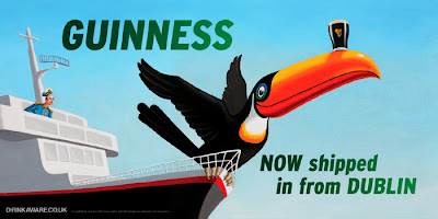
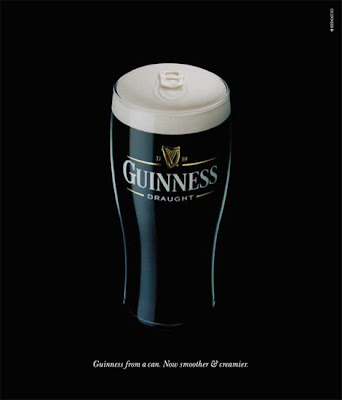
They have also produced some recent print ads for Guinness, one of which reproduces the vintage Guinness advertising by John Gilroy and the other promotes Guinness from a can.


Vintage Guinness Advertising
 Guinness is one of the most famous and widely recognised beer brands in the world. This status has been built from the develpment of their black and white branding and striking advertisements.
I have always admired the vintage Guinness adverts as they grabbed my attention from a young age. It was a few years later that I discovered that they made the foundations for creating a world-leading brand.
The most notable series of adverts were created by Benson's advertising in the 1930s and 1940s. The posters feature the distinctive artwork of John Gilroy and include slogans such as 'Lovely Day For A Guinness', 'Guinness For Strength' and 'Guinness Is Good For You'. More often than not, they would feature animals such as a kangaroo, sealion and most famously, a toucan. The toucan has become an iconic symbol for Guinness and is as recognisable as the Gunness harp logo.

What I admire about these posters is that they have stood the test of time and are occasionally still used by Guinness in their advertising, over 70 years after the first toucan appeared. In the 1930s and 40s, consumers weren't used to such colourful displays in advertising and the use of such abstract subjects such as associating animals with Guinness. The vivid colours, unusual animals and sense of madness made it memorable.
 One of the first designs produced by Gilroy was the 'Guinness For Strength' advertisement, creating the manly status associated with the brand. Ever since, Guinness embraced this appeal and became a hugely popular choice amoungst 'real men'. The simple illustrations of the early advertising have tremendous character, which adds to their charm. It is a refreshing change to see the beginnings of a brand's advertising have a long lasting influence many years later.
Thursday, August 2, 2007
Storm Thorgerson
I came across this artwork for the new Biffy Clyro album 'Puzzle' in an NME review. Drawing on the human body is not a new concept, however, this cover immediately grabbed my attention.
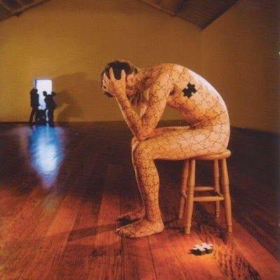
The image is strikingly simple, yet made to appear a lot more complex. The posture of the man is one of anguish and is quite discomforting. The fallen puzzle piece on the floor is what makes this image for me, hinting at the emotions of the man falling to pieces.
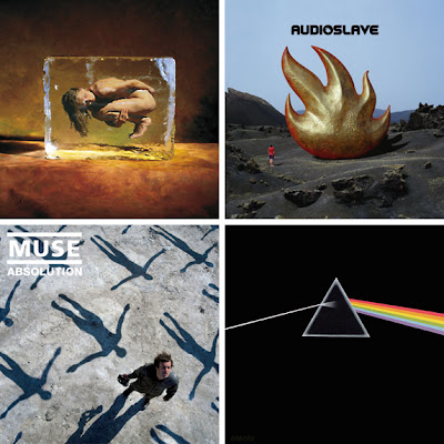
I was surprised to find out that the creator of this artwork was the widely acclaimed designer, Storm Thorgerson, who's work i have admired for a long time. He has produced album art for the likes of Audio Slave, The Alan Parsons Project, Muse and the iconic artwork for 'Dark Side of the Moon' by Pink Floyd, mentioned in my post on iconic album art. You can view his extensive portfolio at www.stormthorgerson.com
The interesting thing about this site is that it includes extensive descriptions about individual artworks, explaining the concept behind each one. They even go as far as to state the location and how the images were were produced. This is an intriguing site to say the least that can provide you with ideas for practice and technique within your work.
The images below are a few that I find particularly inspirational and have paved their way into the iconic realms of album art.

The image is strikingly simple, yet made to appear a lot more complex. The posture of the man is one of anguish and is quite discomforting. The fallen puzzle piece on the floor is what makes this image for me, hinting at the emotions of the man falling to pieces.
I was surprised to find out that the creator of this artwork was the widely acclaimed designer, Storm Thorgerson, who's work i have admired for a long time. He has produced album art for the likes of Audio Slave, The Alan Parsons Project, Muse and the iconic artwork for 'Dark Side of the Moon' by Pink Floyd, mentioned in my post on iconic album art. You can view his extensive portfolio at www.stormthorgerson.com
The interesting thing about this site is that it includes extensive descriptions about individual artworks, explaining the concept behind each one. They even go as far as to state the location and how the images were were produced. This is an intriguing site to say the least that can provide you with ideas for practice and technique within your work.
The images below are a few that I find particularly inspirational and have paved their way into the iconic realms of album art.
Stop Motion Drums & Piano
I came across this video while finding inspiration for the 'motion' brief we were set last year. Although it is an amateur attempt, I admire the use of this technology to produce a musical production that the creator had no previous knowledge on. I have since seen other attempts at stop motion music, but none have been as good as this one. The time taken to edit this video frame by frame and produce something that looks and sounds fairly convincing is a creditable achievement.
St. Botolph's Church aka. The Stump
 When people ask where I'm from, most people have never heard of Boston in Lincolnshire. Maybe the occasional sports fan has heard of its failing football team, but asside from that, Boston lives up to its status as the most remote town in England. Despite its unpopularity, Boston has a lot to be famous for. For instance, a group of monks in the 1600's were imprisoned in Boston's Guildhall, who were responsible for founding Boston, Massachusetts and New England in the USA.
This leads me onto Boston's most famous landmark, commonly known as the Boston 'Stump'. The building of the church took a total of 176 years between 1309 and 1520. Around this time, Boston's port was the second most important in England so the church was built to show off the prosperity of the town.
 The Stump has always been a building I have marvelled at and looks magnificent from a distance and up close. According to numerous sources, 'it has the tallest non-cathedral church tower in the world from the floor to roof (not spire)", which is a hugely impressive status for a building situated in town, who's population is less that the amount of student at Leeds University. The recent addition of orange spotlights give it an eerie presence at night that can be viewed from miles away. Although the public can only climb half way up the huge 272ft tower, the views are spectacular and it is surprising how many people, who have lived in Boston their whole lives have never been up the Stump.
 The design of the church is spectacular and the attention to detail inside and out is amazing. This is a reflection on the amount of time taken to build it and an example of stunning medieval craftsmanship. As a youngster, I would always look up at the roof and try and count the number of intricate tiles. Needless to say, this is an impossible task for anyone, but passed the time well during school ceremonies. I find this building truely inspirational as it is not just an outstanding piece of architecture, but a symbol of the town's heritage and pride.
Stina Persson
I came across these images in an Elle magazine some time ago. They struck me as being particularly elegant and unique so saved them for future reference.
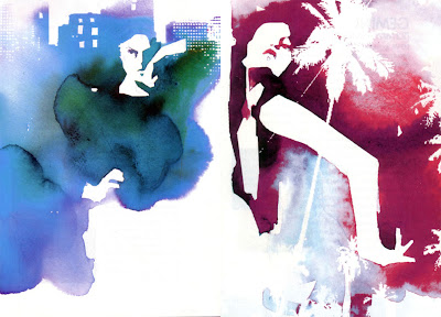
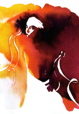 The use of ink, watercolour and gouache is extremely effective and gives the impression that the images have been created from a few blots of ink that have bled out and merged together to form the image. The impressionistic style and simplicity, combined with the vivid colours are extremely effective in drawing attention to the form of the figures and the garments they're wearing. She says that her style is about "finding the right balance between the edgy and the elegant the raw and the beautiful." Her imagery has a querky appeal that works well for fashion illustration.
Her recent projects include the poster for the musical Billy Elliott, the cover for the magazine Flaunt and a summer campaign for Absolut Vodka.
 Stina Persson's work for a Nike Campaign
 Flaunt Magazine cover
Wednesday, August 1, 2007
Sin City (2005)
 Sin City is a graphic, action packed film, written, produced and directed by Frank Miller and Robert Rodriguez. It is primarily based on three of his graphic novels: 'The Big Fat Kill', 'The Hard Goodbye' and 'That Yellow Bastard'.
The styling is particualrly unique for a modern day film. It is shot primarily in black and white with a few select objects left in colour. These are either ones of significance in the frame or for gory details such as blood. Sin City is regarded as a 'neo-noir' film as its styling and colouring are heavily influenced by the film-noir period. The image below is an example, showing Alan Ladd in the 1942 film, This Gun For Hire.
 Although the film was initially shot in high resolution colour, post production converted it into black and white to increase the contrast and make it appear more like the original comic. This technique adds a stylish and artistic aesthetic which i find extremely successful. Not only is the film entertaining in itself, it is made even better by the unusual, visual experience.
Sin City made use of the Sony HDC-950 high definition digital camera and primarily shot the scenes in front of a green screen to allow for the addition of artificial backdrops and some foreground objects such as cars. This combination makes the film one of only a few fully digital, live action motion pictures. This technique was also used on another Frank Miller adaption, 300 released in 2006.
 The image above shows the green screen technique employed by the film and the selective colorisation seen on the girl's red dress and the red of her lips. I especially like the stylistic impression of movement in the film such as the cars' exaggerated jumps over bumps in the road and the fall of rain, which is apparent in the image below.
The effect of high contrast black and white in the film is remarkable and fairly risky when producing for an audience used to high definition colour. The most extensive use of colour in the film is focussed on Roark Junior aka. That Yellow Bastard, played by Nick Stahl. He portrays a repulsive, psychotic child molester who is eventually stopped in his tracks by Detective John Hartigan, played by Bruce Willis. His features are creature like and are made more repulsive by his bright yellow colour in contrast to the black and white surroundings. Even his blood is yellow when he is reduced to messy pulp by Hartigan.

Although the plot and extensive violence in Sin City may not be suited to everbody's taste, the styling and artwork is a true masterpiece and needs to be seen.
Subscribe to:
Posts (Atom)