
Wednesday, September 5, 2007
Illustrating Life With Words
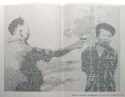
This is a promotional device created by DM9 DDb Publicidade, Sao Paulo in 1998. It is part of a series of ads for a Brazilian newspaper that used newsprint type to recreate famous images. This one shows a memorable photograph of an exocution in Vietnam. The medium for this ad is very creative and seems appropriate for the promotion of a newspaper. It reminded me of a website I once discovered that you could upload an image and it would turn it into text art similar to the style shown in this ad. From a distance, This technique is extremely effective as it is obvious that the image has been produced in a non-conventional way, but requires a closer look for the method to become apparent.
Pandora
 I came across this website called 'Pandora' some time ago and am a regular user. As the name suggests, it opens up a whole new world to the user. Pandora is an online radio station that is as customisable as it can get without infringing on copyright laws. It has an online library of thousands of songs in CD quality with each artist's style analysed and documented. The user can specify a radio station based on the style of an artist or song they like and Pandora will create a playlist based on your personal preference. The user can skip tracks and rate them 'thumbs up' or 'thumbs down'. Pandora remembers the users preference of music and plays more or less of that artist depending on their rating so each station you create gets better and better. It will also retrieve information about an artist if desired and show a profile and gig dates etc.
Pandora is a funtional site that has a simple user interface. It is a great website for those interested in discovering new music in a specific genre or those who fancy a change of music to their own collection.
Tuesday, September 4, 2007
Heinz
These Adverts for Heinz were created by BS Dorland, London in 1991. I chose to show them in this blog as they made me think about the different contributing factors that have bearing on how successful a piece of advertising is. Firstly, they have taken advantage of the fact that Heinz Ketchup pours out of the bottle at a snail's pace and turned it into a charming feature rather than an annoying trait as it could be perceived. This throws a humorous twist on a characteristic that could otherwise put a customer off buying Heinz from a bottle.
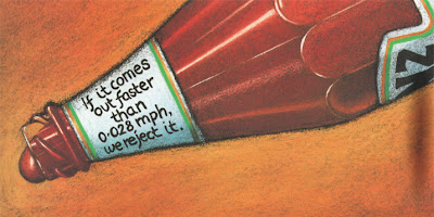
Secondly, the style of these ads is particularly striking. They are created in a painterly kind of way, mimicking a still-life painting and making a feature out of the Heinz branding. This suggests a brand that has values such as loyalty, tradition, logevity and perfection.
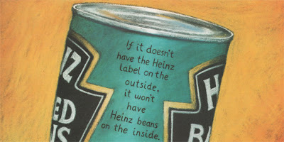
As well as suggesting the brand values of Heinz and having a witty approach to the copy, these adverts also suggest that Heinz is a brand with a conscience that cares about its customers' health. This is strengthened by the copy on the Heinz Salad Cream ad that reads "The only time we use artificial colouring is when we print the label". As a campaign, these three ads work extremely well as each one offers a different value associated with Heinz that will heighten their customers' brand loyalty.

Hot!!!
When I came across this advert for Parmalat Hot Ketchup it immediately grabbed my attention. It was created by Brazilian agency, DM9 DDB Publicidade, Sao Paulo in 1999. I think it is a brilliant example of communication design and admire the simplicity of the image, which works to great effect. The pouring ketchup takes the form of a mouth on fire, as if they have just eaten something really spicy. The blurring of the image intensivies the feeling of heat and the red colour scheme glows above the black background. This ad shows that simplicity is the key to successful communication - just one simple element delivers the message of this brand.


"READ THIS YOU PIECE OF SHIT"
 I have always been interested in impactful imagery and love the use of photography in print advertising, which is why I find Saatchi & Saatchi's cause-related advertising so successful. Often considered shocking or controvercial, Saatchi and Saatchi's designs never fail to grab your attention. For example, this print advert uses shock tactics to offend the reader, initially grabbing their attention and intiguing them enough to read on. After reading the first few paragraphs, you are informed that it is addressing human rights and the headline becomes more appropriate. It reads "If you're offended by this advert, you should be. Nobody should be treated like this. Yet unfortunately, there are millions of people around the world who are."
Their technique is often simple, using imagery with a plain background to increase the focus of the advert with a short, snappy headline that is usually a witty pun to accompany it. These two elements work in harmony with each other on the page to strengthen the idea - without the headline, the imagery would not make sense and vice versa.

A combination of offensive imagery and language is quite humorously contradicted by the polite statement "please clean it up" in this advert adressing dog fouling.

The two images above are particularly impactful. The anti-smoking advert uses an image of a cigarette that has been cleverly transformed into the image of a snail by manipulating the shape of the smoke and has the headline "slow poison". The association created between the headline and image of the snail is witty and memorable. The advert to the right shows the bruised face of baby. Its battered appearance makes it almost appear to be five years older, making it a hard image to forget. Saatchi & Saatchi use a metaphorical headline to highlight the atrocities that occur behind closed doors and bring our attention to towards making a change.

This image shows frames from a television commercial created by Saatchi & Saatchi for NSPCC in 1999. It shows iconic images found in a child's bedroom such as an England footballer and Rupert the bear covering their eyes to the reality of child abuse. It highlights the fact that you don't have to see what's going on to know that there is something sinister happening. I also find this advert a good example of how the shocking acts of child abuse do not need to be shown in order for them to be imagined by the viewer, making the advert accessible by a wider audience and more successful.
Saatchi & Saatchi are world-renowned for their cause-related ideas. There are far too many brilliant ads to write about them all, but these are a few more that I admire.


Monday, September 3, 2007
Smirnoff "Sea"
This is the new CGI masterpiece commercial for Smirnoff, created by JWT London. The first time I saw this advert I was amazed by the extraordinary visual experience and had to find out more about it. The special effects wizards behind the Harry Potter films were called upon to create this amazing TV ad in which war planes, coins, old statues and battleships are ejected by the sea. It expresses the effort that goes into Smirnoff's purification process by linkening it to the purification of the ocean, using the strapline "Extraordinary purification", promoting Smirnoff as the most pure vodka.
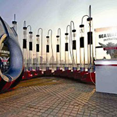 In addition to the online game, Smirnoff have created an ambient promotional device to strengthen their brand values and hit home the extraordinary lengths they go to to purify their vodka.
This is an amazing, state-of-the-art water purification installation that has just appeared at the Rip Curl Board Masters Festival this summer, where it purified Newquay's sea water for adventurous festival goers to sample. The installation takes water directly from the sea, purifying it to make it clean enough to drink there and then. This clever device complements the new television commercial perfectly and has already filtered some of the world's most dirty water on an international tour. Dirty water flows through a three-stage purification process cleaning it to a high level and mimicking the trademark 'triple distilled' slogan of Smirnoff. It is then given a rigorous ten times filtration through Polish charcoal to remove invisible microscopic impurities and give the water a smooth, clean, pure finish for the public to enjoy. This is the same process used in the production of Smirnoff vodka.
The advert is part of a £15m annual marketing budget. It was shot by Daniel Kleinman, the director responsible the opening credits for Casino Royale and a numerous other successful TV commericals. The special effects have been created by Framestore CFC, which created sequences for the Harry Potter films, X-Men: The Last Stand and for Guinness's spectacular evolution-backwards commercial "noitulove" I have previouosly posted on.
Smirnoff are aiming their latest publicity creations at young men. Digital agency AKQA have created an online game called "The Smirnoff Purifier", available at smirnoff.com to complement the TV advert. It allows players to fire objects at a target from a "raised platform off the south coast of England". In addition to the online game, Smirnoff have created an ambient promotional device to strengthen their brand values and hit home the extraordinary lengths they go to to purify their vodka.
This is an amazing, state-of-the-art water purification installation that has just appeared at the Rip Curl Board Masters Festival this summer, where it purified Newquay's sea water for adventurous festival goers to sample. The installation takes water directly from the sea, purifying it to make it clean enough to drink there and then. This clever device complements the new television commercial perfectly and has already filtered some of the world's most dirty water on an international tour. Dirty water flows through a three-stage purification process cleaning it to a high level and mimicking the trademark 'triple distilled' slogan of Smirnoff. It is then given a rigorous ten times filtration through Polish charcoal to remove invisible microscopic impurities and give the water a smooth, clean, pure finish for the public to enjoy. This is the same process used in the production of Smirnoff vodka.
Thursday, August 30, 2007
Lord of the Rings - On Stage!
“THIS SHOW IS A WONDER….
Go with an open heart, wide-open eyes and prepare for enchantment”
The Times
I had never been to the West End before and despite hearing marvellous things about their productions, my expectations weren't high when I went to see the Lord of the Rings at the Theatre Royal. I thought that a musical wouldnt be my 'thing'. This was partly true as I couldn't seem to get quite as involved in the singing and dancing as the man sat next to me, who was literally crying in ecstasy. However, it was a visual spectacle that was thoroughly enjoyable.The Times

The Theatre Royal is a lovely building with an impressive history and a huge auditorium inside. As you enter, an impressive setup awaits with orchestral music that sets the scene for Middle Earth. The Lord of the Rings takes you on a breathtaking journey of enchantment from start to finish. Among the highlights of the show were the dramatic lighting, precision choreography and stunning design. The special effects were second to none and completely unexpected as it is hard to believe they are possible on the stage, for instance, the apparent disappearance of Bilbo Baggins in Scene I. The costume design was particularly impressive and the way in which the stage transformed from one scene to the next, utilising various materials and cloth to great effect.

At a production cost of £25,000,000, it is the most expensive musical to date and sets a high standard for any production looking to better it.
Subscribe to:
Posts (Atom)