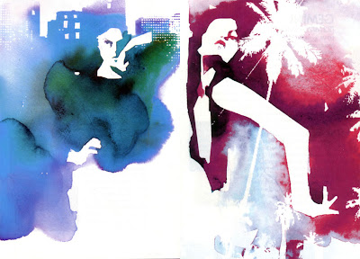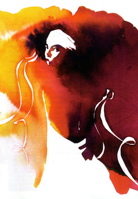
 The use of ink, watercolour and gouache is extremely effective and gives the impression that the images have been created from a few blots of ink that have bled out and merged together to form the image. The impressionistic style and simplicity, combined with the vivid colours are extremely effective in drawing attention to the form of the figures and the garments they're wearing. She says that her style is about "finding the right balance between the edgy and the elegant the raw and the beautiful." Her imagery has a querky appeal that works well for fashion illustration.
Her recent projects include the poster for the musical Billy Elliott, the cover for the magazine Flaunt and a summer campaign for Absolut Vodka.


14 comments:
I really like this work, especially the Flaunt magazine cover. The work's got a real energy that could have only been created by producing most it by hand.
It's interesting to compare it to the Hed Kandi stuff. They are both very modern and feature very simlar subjects and yet they are so different.
I do like the Hed Kandi work, but because it is so slick and obviously computer generated, to me it does seem a bit souless. Or maybe thats the point- because dance music in general is pretty souless.
I have to agree with PT, the hand generated work has such a stronger visual impact. I love the top 2 images, they have a very stylish and elegant feel to them. The nike image has the feel of a James Bond credits sequence.
u r so greaaaaaaattttteeeeeeeee
i love ur work
dharmesh is a skett
haha
hello kinjal
manish is the best
hello kinjal....again =)
kinjal likes art...
kinjal....=P
k...
i...
n...
j...
Post a Comment